the book doctor
Sefer Saver wanted to set a new standard in the heretofore old-fashioned bookbinding industry. After discussing what the brand wanted to change about the classic (usually unprofessional or nonexistent) bookbinding logo, I created a few logo options that highlighted the speed, skill and convenience that the company was offering along with their competitive pricing and outstanding customer service.


flyer design.
next step
flyer design. next step
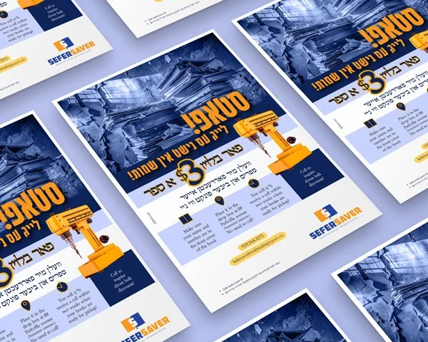
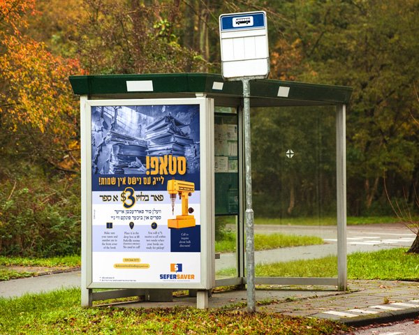
Once the client chose a favorite, I proceeded to create a flyer, which would be hung up in shuls and distributed to libraries. I developed an ad that highlighted a need in the community and then led the reader directly to the cost-effective solution called Sefer Saver. Sticking to the brand’s color system, I worked on an eye-catching design. The color blue was included because it is associated with trust and professionalism, while the orange represented energy, speed, and low cost. The challenge here was fitting so much info onto just one page without having it look overcrowded. Baruch Hashem, I made it work, and I was pleased to hear back from the client that the results (after the brand was launched) exceeded way beyond everyone’s expectations.